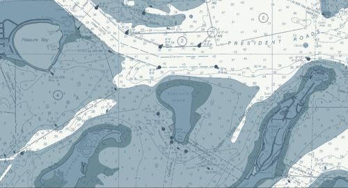
Since we began to offer color changes for free, we have helped our clients achieve some spectacular murals using their own choices of colors. We even have the ability to match colors to all of the colors offered by Benjamin-Moore or Sherwin Williams. Shades of blue work for land as long as the ocean water is white or a light shade of another color. In most cases our clients make great decisions in their color choices. But there are colors that will confuse those familiar with NOAA chart colors to the point that it becomes difficult to see what is land and what is water. That is because there is a paradigm of chart colors that need to be understood before choosing custom colors. Generally there are two paradigms of color: Land and water. Land: NOAA has had a variety of colors for land colors, The land colors range from beige, taupe, and yellow. Land that has a significant population area is often colored a deeper version of the land color. For example beige land with a population area has the population area a darker beige or even a burnt orange color. Here is a chart where land is a yellow color. We brightened the blue for a better contrast. Water: NOAA colors shallow water a light blue, and on some charts water that is a little deeper has a lighter shade of blue to contrast with the darker shallow water. Water over 60 feet at low tide often is white. So if a client wants the land to be a shade of blue and the water a beige, taupe or yellow, it will present a confusing picture to those familiar with NOAA charts. Our Advice: Whenever we receive a request to make water a land color or land a water color, we will advise other choices that a align with the land/water paradigms. In short, we hope to have our client’s murals clearly convey what areas are land and what color is water.

www.nauticalwalls.com

1 13 14 15 16 17 21